NANA | CONSCIOUS LIVING | SAN DIEGO, CALIFORNIA | 2023
NANA | CONSCIOUS LIVING | SAN DIEGO, CALIFORNIA | 2023
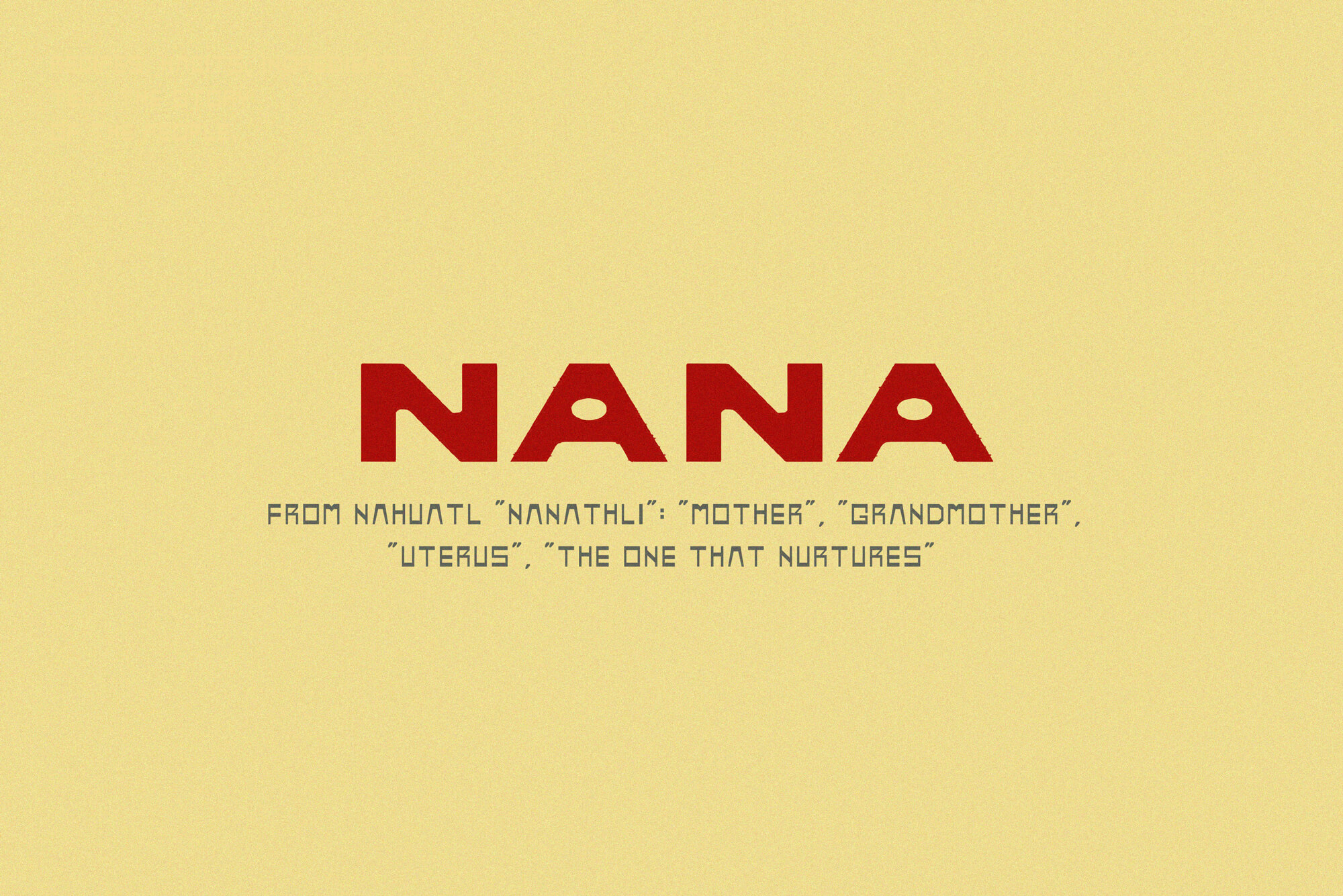
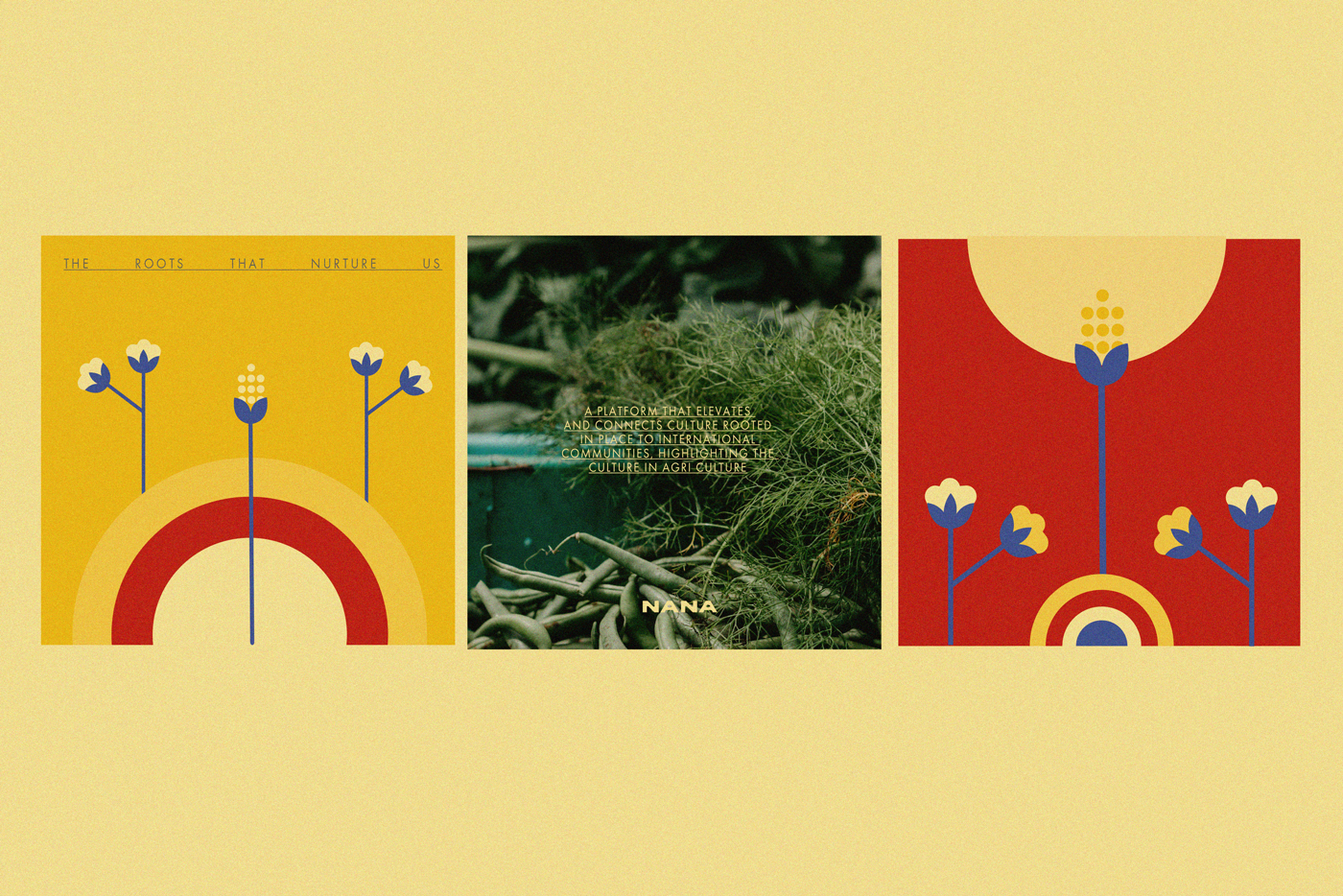
We crafted a distinctive brand identity based on nurturing and the feminine role. Derived from Náhuatl’s “Nanathli,” meaning “mother,” “grandmother,” “uterus,” NANA is a platform that connects CULTURE in agriCULTURE.
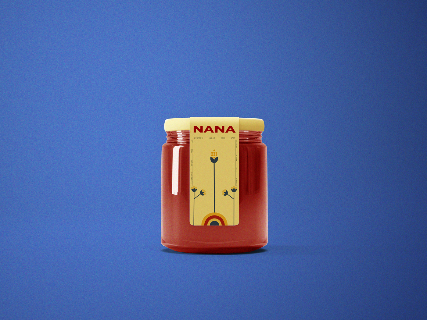
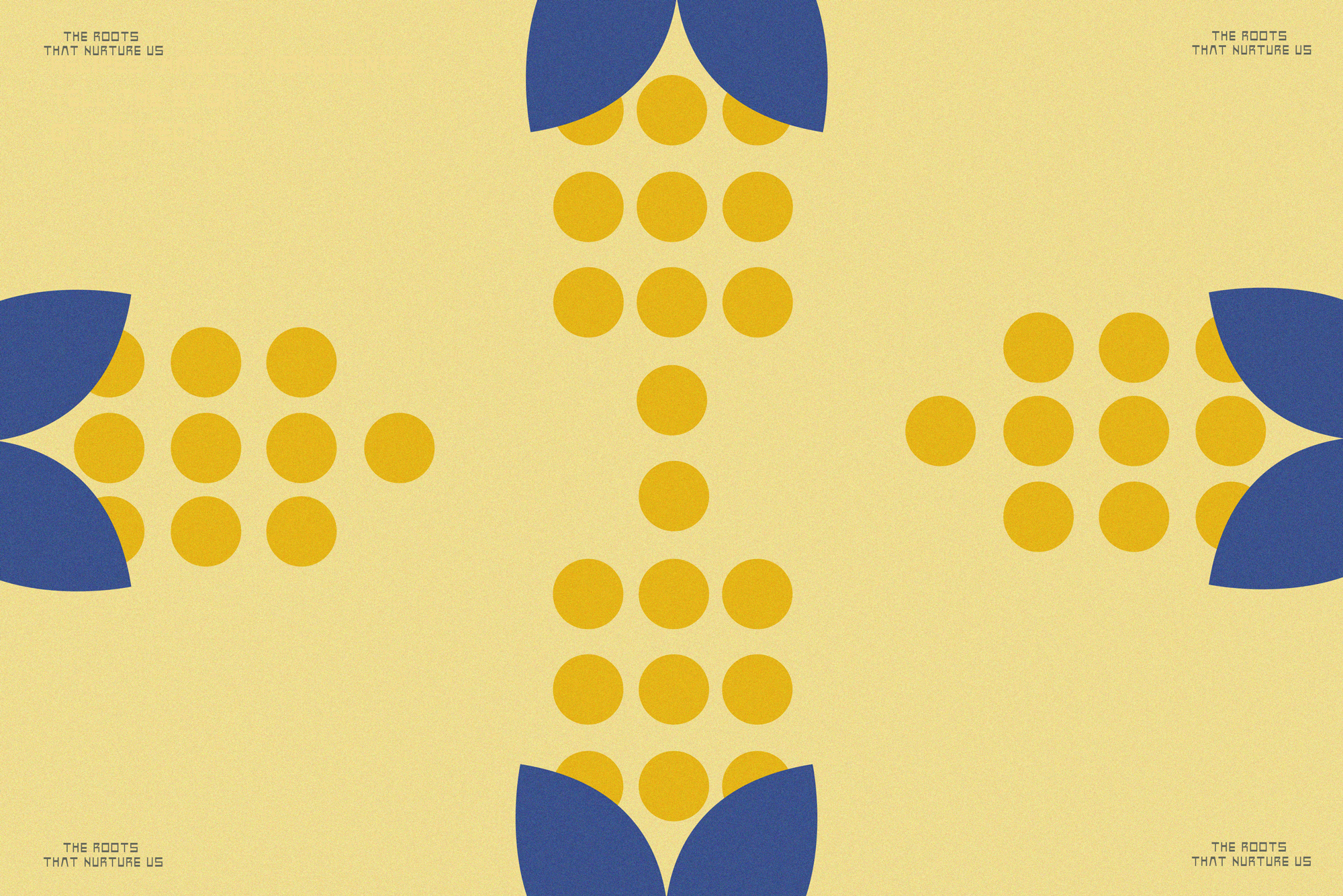
Inspired by 1950s Latinamerican handmade lettering, the NANA logo is an homage to artisanal craftsmanship. Vibrant primary colors were used in reference to food and the streets of Latinamerica.
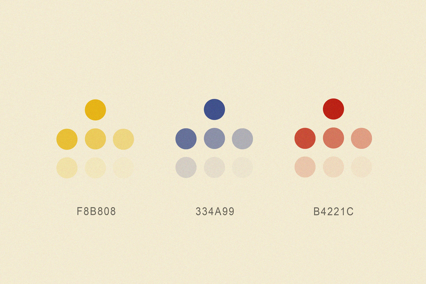
We selected two primary colors, red and yellow, to enhance the brand’s identity. Additionally, we incorporated a touch of blue to provide contrast and prevent monotony.
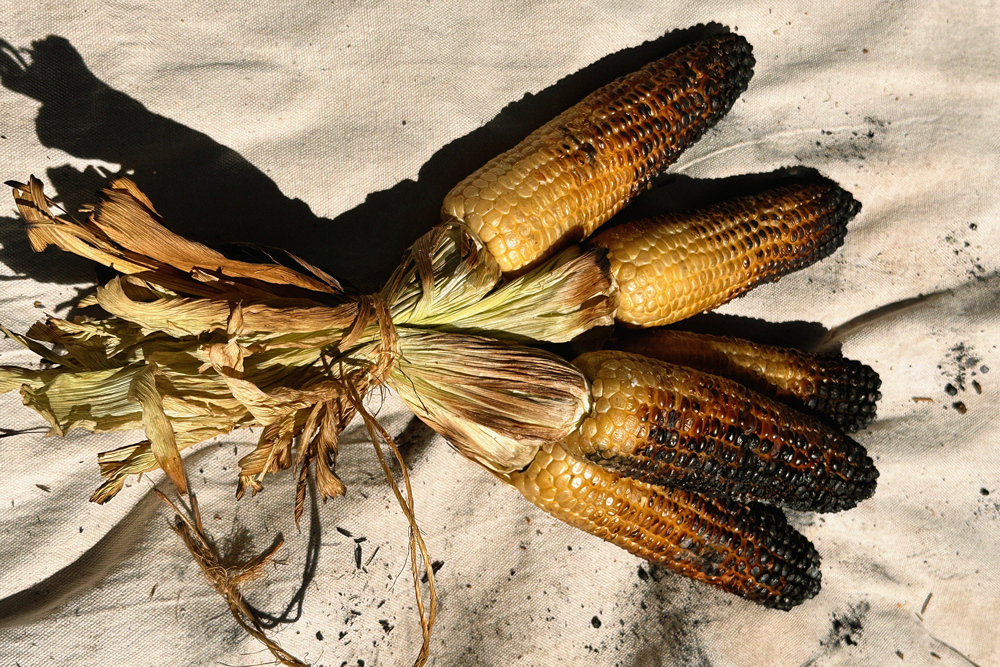
Each logo application and variant was crafted by hand, incorporating illustrations that reference Latin American subsistence species, such as corn.
The branding exercise for Nana involved not only creating a logo but also understanding its various applications in a wide array of formats to truly comprehend the full extent of the logo’s potential.
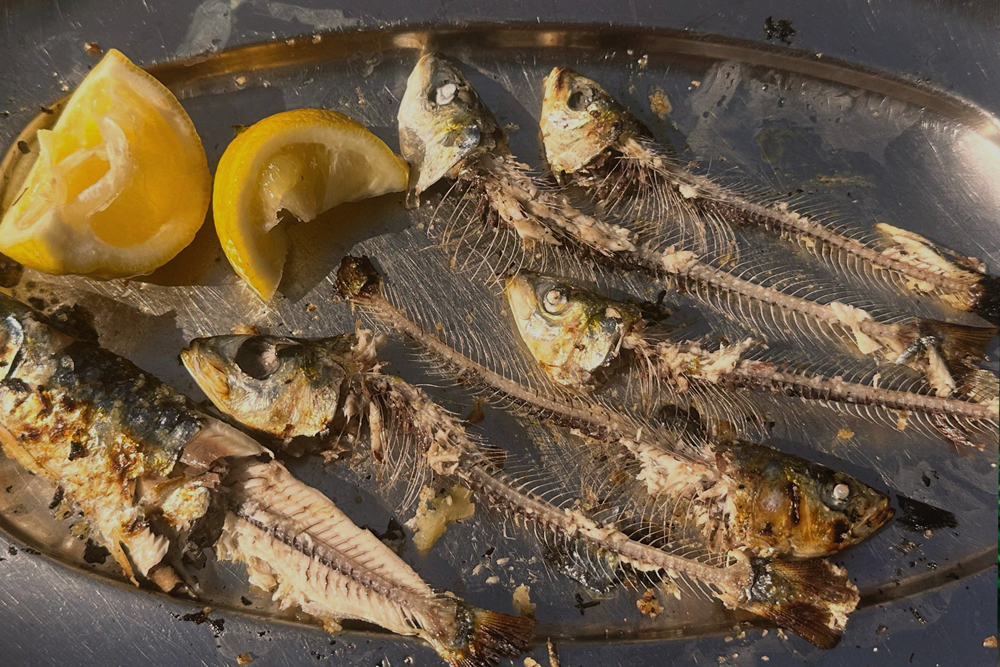
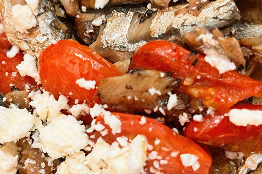
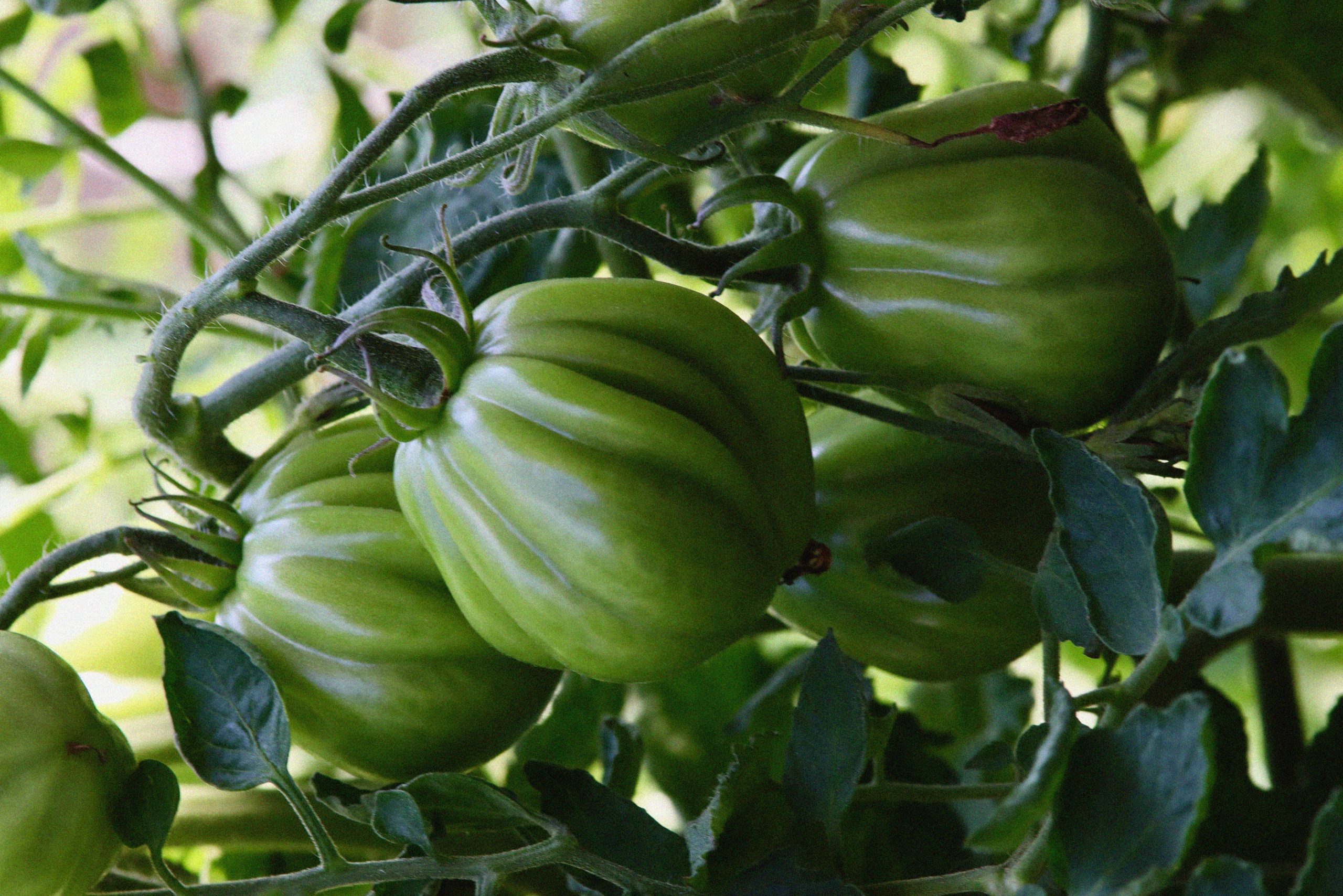
NANA searches to promote wholefoods that are sourced from artisanal old-age methods in Latinamerica to the USA, promoting the values and connection with the origin of these ingredients.
Through collaborative work sessions and client feedback, we proposed and together created the tagline, vision, and massive transformative purpose, embodying the spirit and ethos of NANA.
Each logo application and variant was crafted by hand, incorporating illustrations that reference Latin American subsistence species, such as corn.
NANA is currently working with Farmers’ Footprint generating content and reflections around these topics to link culture, agriculture and ancestral knowledge.
We are very proud to have been able to create this project’s identity. NANA’s informative role becomes more relevant than ever in today’s industrialized systems for food production and promotes wholesome, conscious and regenerative alternatives.